
Everything old is new, and retro games are more popular than ever. Old-fashioned games are back, supported by nostalgia and a wealth of casual arcade-style games on iOS and Android devices. In this tutorial, we will give you some tips for a successful retro-themed game.
Choose a retro style
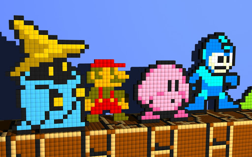
What do you mean when you talk about “retro” games? There is no clear definition, but I usually think of games created before 1990. This includes console games such as GameBoy, NES, Atari 2600 and Commodore 64, as well as classic arcade games such as Pac Man, Centipede and Space Invaders.
All of these examples use block-like pixelated bitmap (or “raster”) graphics. These are the types of games that most people probably think of when thinking about retro games.
Raster Graphics: Pac-Man (Arcade), Frogger (Atari 2600), Super Mario Bros. (Game Boy)However, early video games actually used vector graphics. Games such as Battlezone, Asteroids, and Tempest were rendered with bright, glowing lines instead of blocky pixels.
Vector graphics: Battle Zone (Arcade), Tempest (Arcade), Mine Storm (Vectrex)Another type of game that seniors were playing was a simple handheld game with a monochrome LCD screen and a very simple game mechanism.

LCD Graphics: Donkey Kong Jr. (Games & Watches), Mario’s Cement Factory (Games & Watches).This tutorial will discuss the most popular raster graphics games, but since these other types of games aren’t usually emulated, I think there are plenty of opportunities for game designers to do something really cool. Those styles.
Create a color palette
To create an attractive retro look, you need to work with a limited set of colors.
Old school game consoles could only display a limited number of colors. Depending on your system, the graphics are displayed in black and white, grayscale, or 8-bit or 16-bit colors. You can see an example of the exact color palette for a particular system on Wikipedia, but it’s not important to choose a historically accurate color as long as you maintain a consistent style in the game.
You won’t face the same hardware limitations as before, but limiting the palette to just a few carefully selected colors not only emphasizes the retro beauty, but also defines the identity of the game. Useful. See the following two examples of Super Mario Bros. color palettes.

Since the colors are different, you can almost understand the game with just the color sample.
David Sommers has a great collection of classic game palettes on ColorLovers.com.The exact color you choose depends on the theme and mood of the game, but if you take the time to choose the right set of colors, your game will be as symbolic as classic. Take a look at these latest examples.Adam Atomic’s canabalt, Sean Inman’s last rocket, Polytron’s FezIf you’re having trouble choosing colors that work well together, check out this amazing tutorial by Tyler Sates, Choosing a Color Palette for Game Illustrations.
Choose a pixel size
Retro raster games are most easily recognized for their large chunky pixels, from a time when screen resolutions were much lower. In today’s world of HD displays and Retina displays, the physical pixels on our devices are barely visible – not prominent enough to get the blocky retro look.
In this example, each pixel in our character graph is displayed with four physical pixels.To account for this, we need to use multiple physical pixels to display each visible pixel in our game graphics.
You can decide what level of scaling is appropriate for your game depending on how locked you want your game to look. Generally, enlarging to two or three times the normal size gives a good effect. Keep in mind that the bigger you go, the less you can fit on the screen.
I recommend that you always let your game engine do your pixel scaling for you. This means that all your assets and text are 100% drawn (small) and the game simply scales the entire game canvas to the final size. You could really draw assets with larger pixels, but this will increase file sizes and load times, and can also have a negative impact on game performance.
Inconsistent pixel sizes don’t look very correct.
Trying to scale your assets manually can also lead to inconsistencies in your pixel scale. In the example above, notice how the pixels in the game title are huge compared to the tiny pixels in the “Play Now” button text. Also, our game character is more of a blocker than his jewel or the cave floor. Some of these are subtle differences, but they all add up to make the game look a bit ‘off’.

Neven Mrgan (co-creator of The Incident ) talks a bit more about this on his blog .
Drawing Pixel Art
Creating great looking pixel art can be very difficult. It takes a lot of practice, and it’s too long a topic to fully cover in this tutorial. Here are some links to get you started:
Drawing and animation tools
Many people use regular graphics programs like Photoshop , Gimp , or even MS Paint to draw pixel art.
I found it frustrating to use Photoshop once I started trying to animate the characters and tile seamlessly. So I created a tool called Pickle to help fill in some of the functionality that was missing from traditional editors, such as live animation previews, seamless tile previews, and terrain tile previews.
Pickle has a limited set of features and doesn’t suit everyone’s needs. Luckily there are other similar applications such as Pyxel Edit , ASEPRITE and GraphicsGale .


